Principles of Graphic Design
Graphic design is plays a main role in building a brand and at the same time, in showcasing designers skills. Graphic design is a highly sought-after skill. Society cares about the way things look, and there is a constant need to produce good designs, whether it’s for advertisements, websites, logos, videos, banners, or web content.
The principles of design are the rules for the graphic designer must follow to create an creative and attractive Designs. The fundamental principles of design are Balance, Alignment, Emphasis, Contrast, Repetition, Rhythm, Proportion and White Space.
This article will take you through basic principles of graphic design that will make your next project stand out.
01. Balance

Every element of a design—typography, colors, images, shapes, patterns, etc.—carries a visual weight. Some elements are heavy and draw the eye, while other elements are lighter. The way these elements are laid out on a page should create a feeling of balance.
There are two basic types of balance: symmetrical and asymmetrical. Symmetrical designs layout elements of equal weight on either side of an imaginary center line. Asymmetrical balance uses elements of differing weights, often laid out in relation to a line that is not centered within the overall design.
02. Alignment
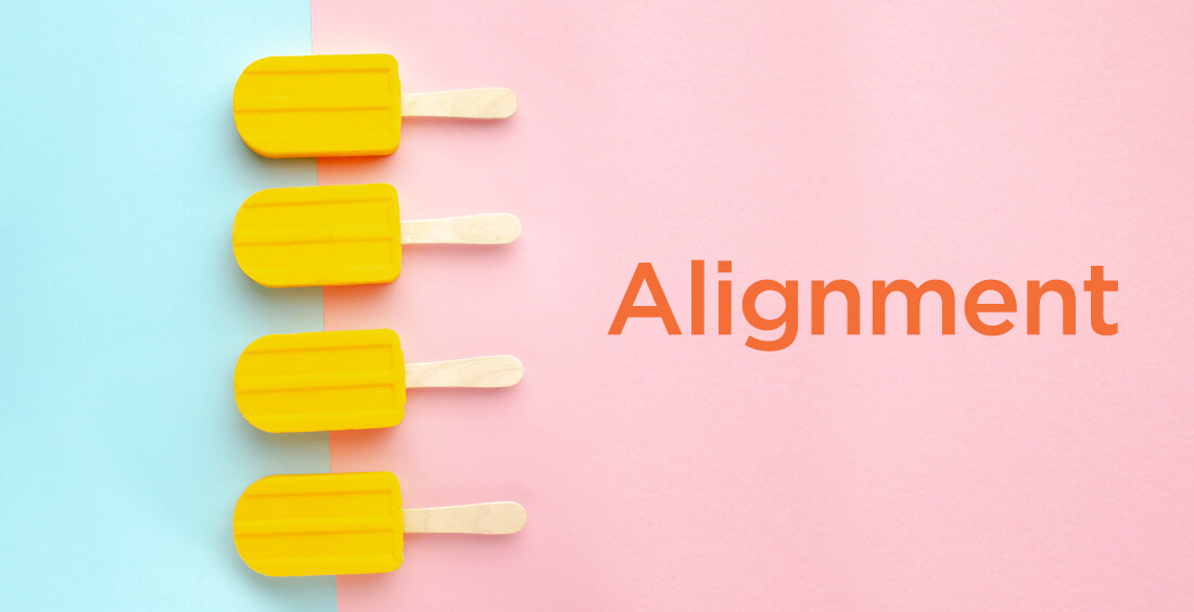
Alignment is an important principle of design. It helps create a sharp, ordered appearance for ultimately better designs by ensuring your various elements have a pleasing connection with each other. Aligning objects properly will ultimately lead to cleaner, better designs and eliminate the messiness or sloppiness that can occur when elements are placed randomly.
In Spark Post, it’s easy to align elements in relation to each other or to your background photo thanks to the dotted line that appears when you move blocks of text or shapes. The app will let you know when you’ve lined up your text or shapes in the middle of your design or with the edges of other elements in your graphic.
03. Emphasis
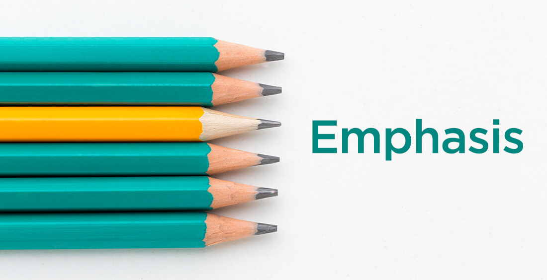
Emphasis deals with the parts of a design that are meant to stand out. In most cases, this means the most important information the design is meant to convey.
Make a mental outline. Let your brain organize the information and then lay out your design in a way that communicates that order. If the band’s name is the most essential information, place it in the center or make it the biggest element on the poster. Or you could put it in the strongest, boldest type. Learn about color theory and use strong color combinations to make the band name pop.
04. Contrast
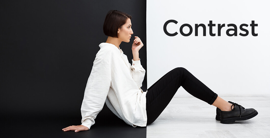
Contrast is what people mean when they say a design “pops.” It comes away from the page and sticks in your memory. Contrast creates space and difference between elements in your design. Your background needs to be significantly different from the color of your elements so they work harmoniously together and are readable.
If you plan to work with type, understanding contrast is incredibly essential because it means the weight and size of your type are balanced. How will your audience know what is most important if everything is in bold?
As you seek out examples of really strong, effective design, you’ll notice most designs only feature one or two typefaces. That’s because contrast can be effectively achieved with two strong fonts (or even one strong typeface in different weights). As you add fonts, you dilute and confuse the purpose of your design.
05. Repetition
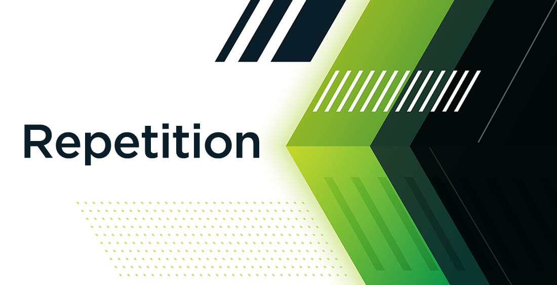
Repetition is a great way to reinforce an idea. It’s also a great way to unify a design that brings together a lot of different elements. Repetition can be done in a number of ways: via repeating the same colors, typefaces, shapes, or other elements of a design.
This article, for example, uses repetition in the format of the headings. Each design principle is formatted the same as the others in this section, signaling to readers that they’re all of equal importance and that they’re all related. Consistent headings unify these elements across the page.
06. Proportion
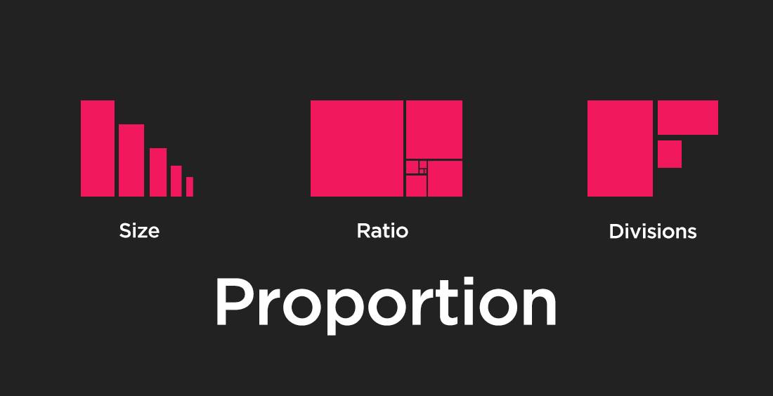
Proportion is the visual size and weight of elements in a composition and how they relate to each other. It often helps to approach your design in sections, instead of as a whole.
Grouping related items can give them importance at a smaller size—think of a box at the bottom of your poster for ticket information or a sidebar on a website for a search bar. Proportion can be achieved only if all elements of your design are well-sized and thoughtfully placed. Once you master alignment, balance, and contrast, proportion should emerge organically.
07. Rhythm
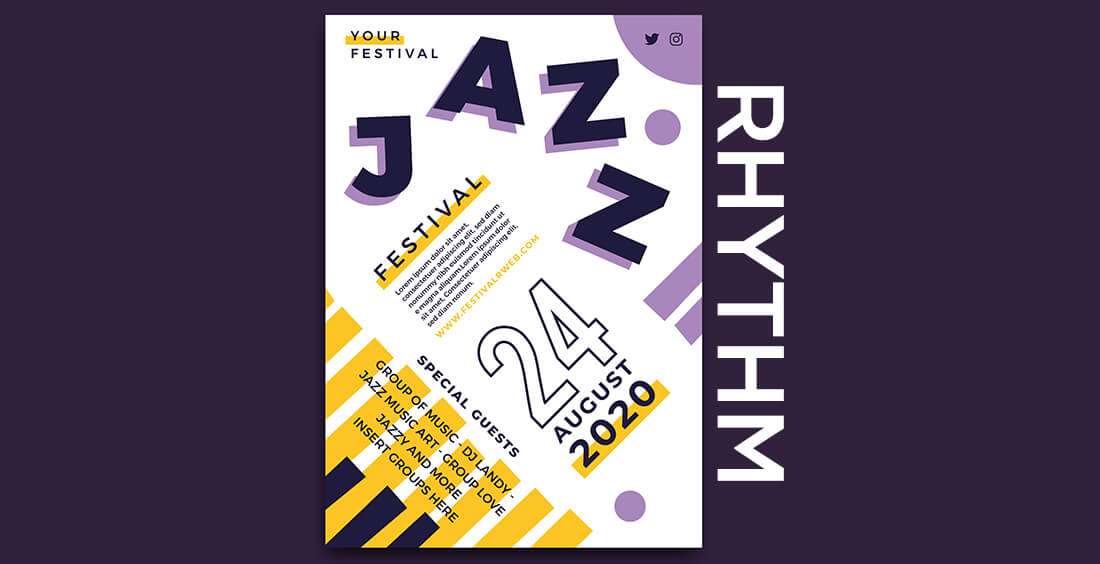
The spaces between repeating elements can cause a sense of rhythm to form, similar to the way the space between notes in a musical composition create a rhythm. There are five basic types of visual rhythm that designers can create: random, regular, alternating, flowing, and progressive.
Random rhythms have no discernable pattern. Regular rhythms follow the same spacing between each element with no variation. Alternating rhythms follow a set pattern that repeats, but there is variation between the actual elements (such as a 1-2-3-1-2-3 pattern). Flowing rhythms follow bends and curves, similar to the way sand dunes undulate or waves flow. Progressive rhythms change as they go along, with each change adding to the previous iterations.
08. White Space
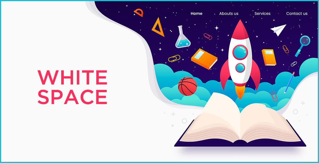
All of the other elements deal with what you add to your design. White space (or negative space) is the only one that specifically deals with what you don’t add. White space is exactly that—the empty page around the elements in your composition. For beginning designers it can be a perilous zone. Often simply giving a composition more room to breathe can upgrade it from mediocre to successful.
White space isn’t sitting there doing nothing—it’s creating hierarchy and organization. Our brains naturally associate ample white space around an element with importance and luxury. It’s telling our eyes that objects in one region are grouped separately from objects elsewhere.
Even more exciting, it can communicate an entirely different image or idea from your main design that will reward your audience for engaging with it. The logo above uses active negative space to communicate multiple ideas in one fun, creative design. Read more details