Color Theory -
Color theory is the collection of rules and guidelines which designers use to communicate with users through appealing color schemes in visual interfaces. To pick the best colors every time, designers use a color wheel and refer to extensive collected knowledge about human optical ability, psychology, culture and more.
Color theory for designers - Article
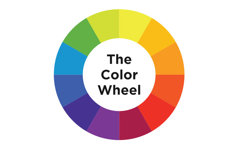
The first color wheel was designed by Sir Isaac Newton in 1666 so it absolutely predates your introduction to it in kindergarten. Artists and designers still use it to develop color harmonies, mixing and palettes.
The color wheel consists of Three Primary Colors (Red, Yellow, Blue), Three Secondary Colors (Colors created when Primary Colors are mixed: Green, Orange, Purple) and Six Tertiary Colors (Colors made from Primary and Secondary Colors, such as Blue-Green or Red-Violet).
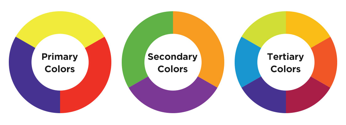
Primary Colors - Red, yellow and blue
In traditional color theory (used in paint and pigments), primary colors are the 3 pigment colors that cannot be mixed or formed by any combination of other colors. All other colors are derived from these 3 hues.
Secondary Colors - Green, orange and purple
These are the colors formed by mixing the primary colors.
Tertiary Colors - Yellow-orange, red-orange, red-purple, blue-purple, blue-green & yellow-green
These are the colors formed by mixing a primary and a secondary color. That's why the hue is a two word name, such as blue-green, red-violet, and yellow-orange.
• Color Scheme
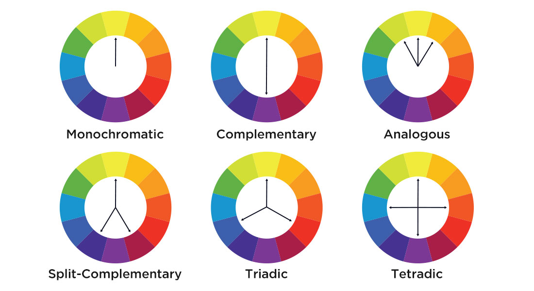
Monochromatic Color Scheme - Take one hue and create other elements from different shades and tints of it.
Complementary color scheme - Colors that are opposite each other on the color wheel are considered to be complementary colors (example: red and green).
The high contrast of complementary colors creates a vibrant look especially when used at full saturation. This color scheme must be managed well so it is not jarring.
Complementary color schemes are tricky to use in large doses, but work well when you want something to stand out.
Analogous color scheme - Analogous color schemes use colors that are next to each other on the color wheel. They usually match well and create serene and comfortable designs.
Analogous color schemes are often found in nature and are harmonious and pleasing to the eye.
Make sure you have enough contrast when choosing an analogous color scheme.
Split-Complementary (Compound Harmony) - The split-complementary color scheme is a variation of the complementary color scheme. In addition to the base color, it uses the two colors adjacent to its complement.
This color scheme has the same strong visual contrast as the complementary color scheme, but has less tension.
The split-complimentary color scheme is often a good choice for beginners, because it is difficult to mess up.
Triadic color scheme - A triadic color scheme uses colors that are evenly spaced around the color wheel.
Triadic color schemes tend to be quite vibrant, even if you use pale or unsaturated versions of your hues.
To use a triadic harmony successfully, the colors should be carefully balanced - let one color dominate and use the two others for accent.
Tetradic (Rectangle) color scheme - The tetradic or rectangle color scheme uses four colors arranged into two complementary pairs.
This rich color scheme offers plenty of possibilities for variation.
Tetradic color schemes works best if you let one color be dominant.
Square color scheme - The square color scheme is similar to the rectangle, but with all four colors spaced evenly around the color circle.
Square color schemes works best if you let one color be dominant.
• The Meaning of Colors
| Name | Color | Meaning |
| Red | Energy, Passion and Danger | |
| Orange | Creativity, Youth and Enthusiasm | |
| Yellow | Happiness, Hope and Spontaneity | |
| Green | Nature, Growth and Harmony | |
| Blue | Calm, Trust and Intelligence | |
| Purple | Luxury, Mystery and Spirituality | |
| Pink | Femininity, Playfulness and Romance | |
| Brown | Wholesomeness, Warmth and Honesty | |
| Black | Elegance, Power and Sphistication | |
| White | Minimalism and Simplicity | |
| Gray | Professionalism, Formality and Conventionality | |
| Multicolor | Fun, Diversity and Optimism | |
| Gold, Silver, Bronze | Wealth, Prosperity and Success |